At Maywood Public Library District (MPLD), I have worked in both Adult and Youth Services. One of the biggest differences between these departments–separated by floors at MPLD–is the visual appeal of the walls and shelves. While the Youth Services floor is covered in reading posters, crafts made by youth patrons, and color, the Adult Services floor is distinguishably lacking in all three categories.
Obviously, some of these elements are specific to youth patrons: most reading posters are marketed toward children, most adult crafting nights end with patrons taking their items home, and most of the interior design revolves around beige, tan, and gray. Some libraries today are getting a lot better at incorporating color and eye-catching design throughout the entire library, focusing on areas beyond the youth shelves, but I would say the majority of public library branches look like Maywood.
As someone who has always enjoyed good poster design, and someone who believes that environments heavily contribute to output and energy, I created a line of posters marketing MPLD’s resources and services. Some of these services, such as the Museum Adventure Pass, are already heavily used by patrons, but other resources are highlighted specifically to promote and get more patrons involved in all aspects of the library.
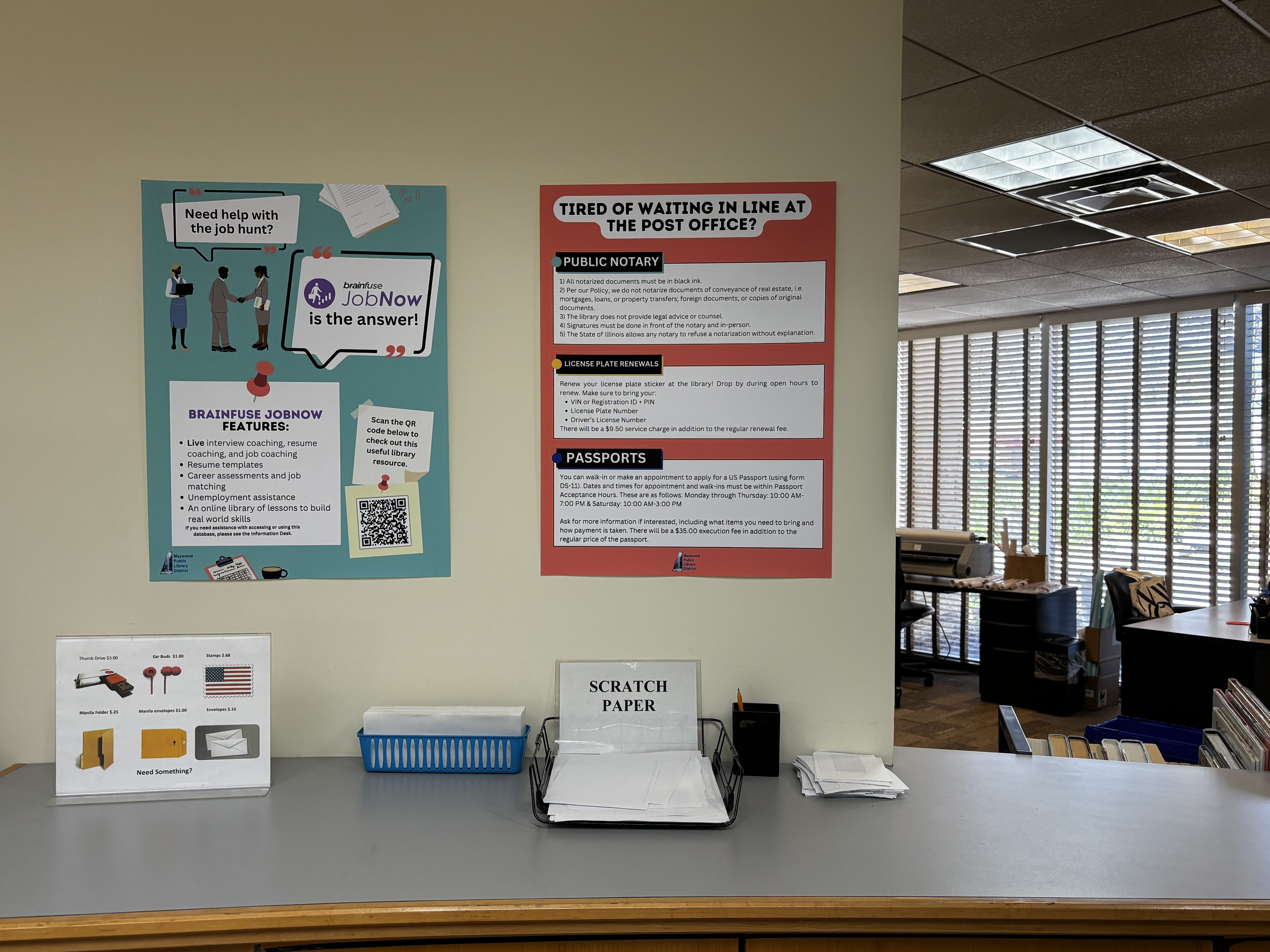


Working in a public library has specific challenges, such as working with the tools you were given (i.e. beige walls). Another set of tools you must work with are the processes and procedures already in place, some of which are written down for the public to better understand. I would love to see all the posters and public-facing information match these colors and fonts to have consistency throughout the department.
One great aspect of MPLD specifically is the variety of programs we have for the local community. These are marketed with beautiful, 11×17 inch posters that live in the library rotunda and occasionally on the Adult Services main doors. I think the Adult Services colors and fonts chosen for our permanent posters would contrast these in smart ways, too.

